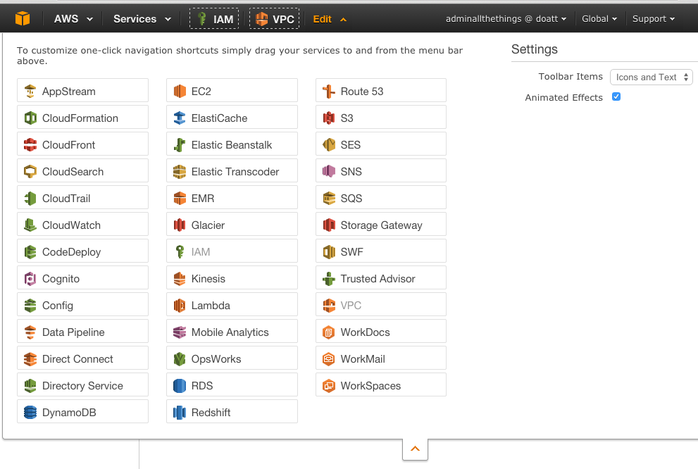
So while there are 38 (and counting!) distinct AWS services, I generally find that I only use around a third of them.
That said, with 10 or more frequently used services, navigating between them can be intimidating. AWS do give a way of adding shortcuts to the top menu, however by default they also enable the name to show next to the icon. If you are only using two or three services this isn't a big deal, but after 5 or 6 you start to run out of space.
The default view looks like so:

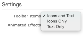
When dragging the icons up to the bar, its easy to miss the settings menu which sits on the right-hand side:

Switching this to Icons only then minimises the width each option takes up - which shortens the toolbar to look like this:

You don't have to worry about the icons being confusing. At first they are, but after using the various services consistently for a while you will not only get used to which color means which service, but also which piece of the puzzle so to speak each icon represents. I've found most complement each other in some shape or pattern - almost feels deliberate really!